Color Table Chart – Effective Data Visualization
RJ0600054_16
- Last Update 07/05/2025
- File Size 1.9MB
- # of Slides 2
- File Format PPTX
- Slide Ratio 16:9
- Color
Keywords
About the Product
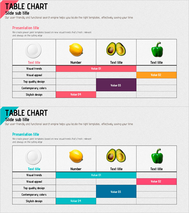
A horizontal table chart PowerPoint slide designed for effective data comparison and information organization. This presentation template features 2 layout variations with 4 color schemes—pink, orange, purple, and teal—enabling visual emphasis and clear data categorization. Each row represents a category (Visual Trends, Visual Appeal, Top Quality Design, Contemporary Colors, Stylish Design), while columns display values (Value 01–04) for item-by-item comparison. Ideal for product presentations, marketing analysis, and business reports, this 16:9 PPTX slide is fully editable. Customize colors, text, and cell sizes to match your presentation needs and highlight key data points.
Usage Points
-
Main Usage
Compares multiple items' metrics and attributes in a matrix format, organizing information systematically. Visualizes quantitative data such as product feature comparisons, marketing performance metrics, organizational evaluation results, and customer satisfaction surveys to enhance audience comprehension.
-
How to Use
Select one of the 2 slide layouts and color scheme that best fits your presentation context. Enter category names in row headers and item names in column headers, then populate cells with numerical values or text. Adjust color-highlighted areas to emphasize key data, and freely customize fonts and cell sizes to match your branding.
-
Recommended For
Marketing professionals, planners, analysts, and executives preparing data-driven decision-making materials. Suitable for product comparison presentations, quarterly performance reports, market research findings, organizational performance reviews, and client proposal documents requiring credible information delivery.
-
Slide Structure
Both slides feature a 5-row (categories) × 4-column (items) table structure. The first slide emphasizes pink, orange, and purple; the second highlights teal and pink. Each cell is an independently editable text box. A title and subtitle area at the top clearly identifies the slide topic and supports flexible content adaptation.
Related Products
-

Athletic Diagram – Connecting Sports and Vision
#Business Introduction #Business Management #Diagram
-

PowerPoint Template for Service Operation Strategy Presentation
#Business Management #Operational Plan #Technical Approach
-

Chart Analysis of External Activities – Performance and Strategy
#Company Introduction #Business Strategy #Diagram
-

Pixel Graphical Maps and Tables - Visualizing Global Network
#Company Introduction #Market and Competitor Analysis #Diagram
