Maps and Horizontal Stacked Charts – Ideal for Market Analysis Infographic
RJ0500013_19
- Last Update 06/10/2025
- File Size 6.7MB
- # of Slides 2
- File Format PPTX
- Slide Ratio 16:9
- Color
Keywords
- #Content-Based Slides
- #Design-Based Slides
- #Market and Competitor Analysis
- #Marketing Plan and Strategy
- #Graph
- #Other
- #Target Market
- #Marketing Strategy
- #Horizontal Bar
- #Grouped Horizontal Bar
- #16:9
- #map and bar chart PowerPoint
- #horizontal bar graph slide template
- #market analysis presentation
- #regional data visualization
- #comparison chart PowerPoint slide
About the Product
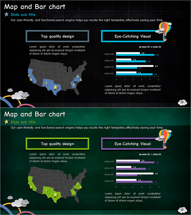
A 2-slide PowerPoint presentation combining a US map with horizontal bar charts for data visualization. Dark background with blue and lime accent colors highlights regional data, while four horizontal bars compare numerical values side by side. Ideal for market analysis, regional performance reports, and marketing strategy presentations. Fully editable PPTX format in 16:9 aspect ratio.
Usage Points
-
Main Usage
This slide enables simultaneous comparison of regional and item-level data. The map intuitively displays spatial information while horizontal bars clearly visualize numerical differences across four values. Perfect for presenting regional market size, sales volume, customer distribution, and geographic performance metrics.
-
How to Use
The first slide features a two-column layout with map on the left and chart on the right. Modify the highlighted regions (blue and lime colors) on the map to indicate target areas, then update the four bar values with your actual data. Text boxes and legend elements are fully customizable.
-
Recommended For
Marketing and sales professionals, business analysts presenting regional performance data, management consultants, market researchers, strategy planners requiring geographic analysis, and executives developing global business strategies.
-
Slide Structure
2-slide deck. Each slide contains a US map with 5–8 highlighted states and a 4-series horizontal bar chart (value 01–04). Dark background with blue, lime, and white color scheme distinguishes data layers. Includes 2 text boxes and decorative icon elements for visual balance.
Related Products
-

Europe Structure Presentation Template – Market Analysis and Marketing Strategy
#Market and Competitor Analysis #Marketing Plan and Strategy #Other
-

European Target Market Analysis Bar Graph – Market Vision and Opportunities
#Market and Competitor Analysis #Graph #Other
-

Visualizing Country Design Preferences with Rectangle Diagrams
#Market and Competitor Analysis #Marketing Plan and Strategy #Graph
-

Target Market Location Icon – Global Market Insights
#Market and Competitor Analysis #Marketing Plan and Strategy #Other
