Big Data Analysis Area Diagram
RJ0400053_8
- Last Update 06/01/2025
- File Size 0.2MB
- # of Slides 2
- File Format PPTX
- Slide Ratio 16:9
- Color
Keywords
- #Content-Based Slides
- #Design-Based Slides
- #Company Introduction
- #Business Introduction
- #Diagram
- #Business Areas
- #Business Areas
- #Cluster
- #Chain Diagram
- #16:9
- #cluster diagram PowerPoint
- #concentric circle diagram
- #3-layer structure slide
- #radial diagram template
- #big data analysis PowerPoint
- #business domain classification slide
- #how to create cluster diagram in PowerPoint
About the Product
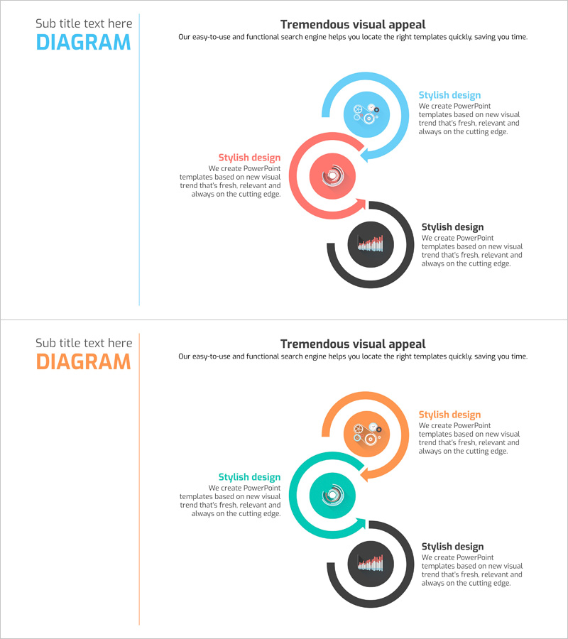
A radial cluster diagram PowerPoint slide with three concentric circles expanding from a central concept. The design uses blue, red, and black color schemes to clearly represent hierarchical relationships and data domains. Each circle contains icon areas and text fields for describing business domains, data analysis, and classification structures. The 2-slide set provides two color variations so you can choose the version that best fits your presentation context. Delivered as a 16:9 widescreen PPTX file ready for immediate editing and customization.
Usage Points
-
Main Usage
Visualizes hierarchical relationships expanding from a central concept to surrounding domains. Ideal for explaining multi-layered data such as big data analysis, business domain classification, product portfolio structure, and organizational hierarchies. Each layer's icons and text fields enable clear specification of concrete items.
-
How to Use
Use in the business overview, strategy, or market analysis sections of presentations to explain organizational structure, product portfolios, market segmentation, or technology stacks. Simply edit the text and icons in each circle to match your specific data and requirements.
-
Recommended For
Recommended for business strategists, data analysts, marketing professionals, and executives preparing reports that require clear hierarchical information presentation. Particularly suitable for big data companies, IT startups, and consulting firms presenting strategic initiatives and business explanations.
-
Slide Structure
2-slide set featuring identical 3-layer concentric circle structures with different color combinations. Each slide consists of a central circle (blue/orange) + middle circle (red/turquoise) + outer circle (black/orange), with icon areas and text input spaces positioned within each circle for customization.
Related Products
-

Traditional Pattern Diagram – Business Introduction and Connection
#Company Introduction #Business Introduction #Diagram
-

Pentagonal Star Diagram – Cluster for Business Introduction
#Company Introduction #Business Introduction #Diagram
-

Internet of Things Service Area Diagram – Business Introduction and Visualization
#Company Introduction #Business Introduction #Diagram
-

Diffusion Diagram Without Center – Effective Business Introduction
#Company Introduction #Business Introduction #Diagram
