Big Data Analysis Schedule – Visualizing Business Strategy
RJ0400053_25
- Last Update 06/01/2025
- File Size 0.1MB
- # of Slides 2
- File Format PPTX
- Slide Ratio 16:9
- Color
Keywords
- #Content-Based Slides
- #Design-Based Slides
- #Business Strategy
- #Operational Plan
- #Diagram
- #Text Box
- #Roadmap
- #Project Implementation Schedule
- #Table
- #Speech Bubble
- #16:9
- #schedule table PowerPoint slide
- #monthly timeline presentation
- #project schedule template
- #how to create a timeline in PowerPoint
- #business planning slide
About the Product
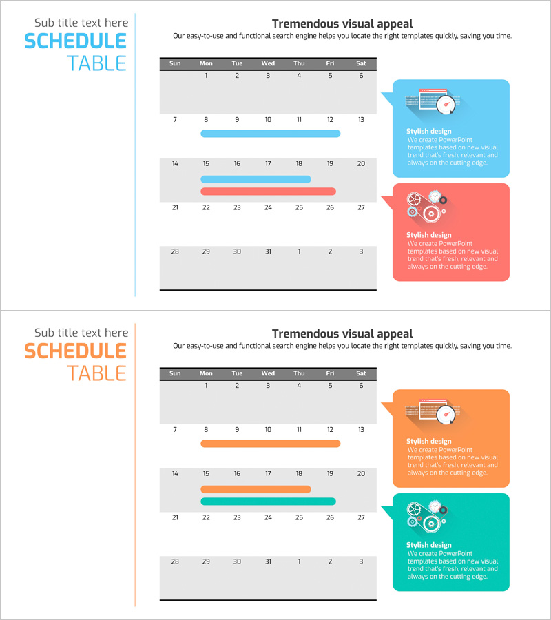
A 2-slide PowerPoint set that visualizes business strategy and operational planning through a monthly schedule table. The timeline layout features blue and red accent bars to highlight key milestones, project phases, and critical tasks at a glance. Each slide is optimized for weekly or monthly schedule management with balanced text input areas and visual emphasis elements. Instantly applicable to presentation decks, operational plans, business reports, and project proposals.
Usage Points
-
Main Usage
Visualize project timelines, milestones, and key deliverables on a monthly or weekly basis, enabling teams to share schedules and track progress effectively across all stakeholders.
-
How to Use
Enter specific dates and tasks in each calendar cell, then drag the blue and red accent bars to mark corresponding time periods. Use in presentation sections covering monthly plans, quarterly objectives, and project roadmaps.
-
Recommended For
Ideal for business reports, operational plans, project proposals, quarterly performance reviews, and team meetings prepared by project managers, business planners, and operations professionals.
-
Slide Structure
2-slide set with day headers (Sun–Sat), date cells (1–31), and two color-coded accent bars (blue and red) per slide. Each slide contains 5–6 text input zones for flexible schedule management and milestone marking.
Related Products
-

Key Stage Roadmap – Visually Clean Diagram
#Business Strategy #Operational Plan #Diagram
-

Business Promotion Schedule Roadmap – Effective Operational Plan
#Business Strategy #Operational Plan #Diagram
-

Round Area Schedule Roadmap – Business Strategy
#Business Strategy #Operational Plan #Diagram
-

August, September, October Calendar Diagram – Essential for Business Strategy
#Business Strategy #Operational Plan #Diagram
