Blood Pressure Measurement Comparison Diagram
RJ0400045_29
- Last Update 05/29/2025
- File Size 3.1MB
- # of Slides 2
- File Format PPTX
- Slide Ratio 16:9
- Color
Keywords
About the Product
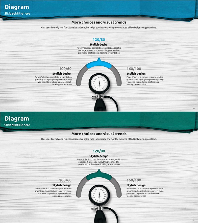
A PowerPoint slide that visualizes blood pressure measurement data in a four-quadrant comparison structure. The layout features a central analog gauge with numerical input fields positioned at the top left, center, and top right, complemented by a teal header and light gray background that conveys trust and professionalism for medical and technical presentations. The 2-slide set includes color variations (teal and dark teal) enabling immediate application for comparative analysis and time-series data representation. Ideal for medical device companies, healthcare technology firms, and clinical research teams presenting measurement values, sensor performance, and clinical indicators.
Usage Points
-
Main Usage
Visualizes blood pressure readings, sensor performance, and clinical data in a four-quadrant comparison structure for medical device and healthcare technology presentations. The central gauge and left-right numerical fields simultaneously display reference values, measurements, and deviations, providing clear decision-making evidence.
-
How to Use
Enter actual blood pressure values into the text fields (top left 100/60, center 120/80, top right 160/100) and adjust the gauge needle position to represent measurement status. Use the 2-slide color variations to arrange comparative slides by time period, patient, or device type in sequence.
-
Recommended For
Medical device manufacturers, healthcare startups, clinical research teams, and medical technology consulting firms presenting product performance, technical validation reports, and investment pitch decks. Also suitable for technical briefings to physicians, nurses, and medical professionals explaining measurement principles and accuracy.
-
Slide Structure
2-slide set. Each slide comprises a teal header (title area), central analog gauge (visual focal point), three numerical input fields (top left, top right, center top), and bottom explanation text area. Color variations (teal and dark teal) enable representation of data hierarchy or temporal sequence.
Related Products
-

Drone System Configuration Diagram – Optimized Operations Through Innovative Technology
#Operational Plan #Technical Approach #Diagram
-

Analysis of Key Internet of Things Services – Technology Current Status and Structure
#Business Introduction #Technical Approach #Diagram
-

Diagram Slide Visualizing Payment System Configuration Contents
#Product/Service Introduction #Technical Approach #Diagram
-

SEO System Configuration Diagram – Technology Sector Strategy
#Business Vision and Strategy #Technical Approach #Diagram
