Key Achievements and Service Benefits Infographic Slide – Red and Blue
RJ0400028_13
- Last Update 05/25/2025
- File Size 1.4MB
- # of Slides 2
- File Format PPTX
- Slide Ratio 16:9
- Color
Keywords
- #Content-Based Slides
- #Design-Based Slides
- #Company Introduction
- #Product/Service Introduction
- #Diagram
- #Key Achievements
- #Benefits and Advantages
- #Cluster
- #Closed Cluster Diagram
- #16:9
- #cluster diagram PowerPoint
- #circular infographic slide
- #business metrics visualization
- #3-node diagram template
- #dual-tone infographic PowerPoint
- #performance data slide design
About the Product
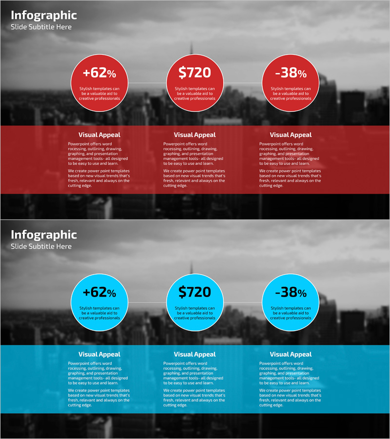
A 3-circle cluster diagram PowerPoint slide that visualizes key achievements and service benefits with striking red and blue dual-tone color scheme. Each circular node contains quantitative data (percentages, currency values, or metrics) paired with descriptive text, enabling simultaneous communication of numerical insights and qualitative messaging. The 2-slide deck includes both red and blue versions, allowing you to select the appropriate color palette based on presentation context and brand guidelines. Formatted in 16:9 widescreen PPTX, fully editable text and numbers enable instant adaptation to various business metrics, financial reports, and performance dashboards without design constraints.
Usage Points
-
Main Usage
Simultaneously present quantitative performance metrics (percentages, currency, KPIs) and qualitative service benefits using three independent yet visually connected circular nodes. The red and blue dual-tone color scheme emphasizes contrasting perspectives, making comparative analysis immediately apparent to executive audiences.
-
How to Use
Insert into executive briefings, quarterly business reviews, marketing performance reports, investor pitch decks, and customer value proposition slides. Edit the numerical values and descriptive text within each circle to reflect actual data, and customize colors to align with corporate branding standards or presentation themes.
-
Recommended For
Executive presentations, investor relations (IR) pitches, marketing team performance reviews, sales team value propositions, and consulting firm client deliverables. Primary users include C-suite executives, CFOs, marketing directors, business analysts, and project leaders requiring data-driven decision support.
-
Slide Structure
2-slide set (red version + blue version). Each slide features a cityscape background with three circular nodes arranged horizontally. Each node displays quantitative data at the top and descriptive text below. A 'Visual Appeal' section at the bottom provides three columns of detailed explanatory text, creating a clear information hierarchy.
Related Products
-

Key Benefits and Value Proposition – Differentiated Services
#Product/Service Introduction #Business Introduction #Diagram
-

Product Features and Differences – Stylish Design
#Product/Service Introduction #Diagram #Features
-

Product Technical Strengths – Innovation and Competitiveness
#Product/Service Introduction #Business Introduction #Diagram
-

Effectiveness of Planterior Design – Capturing Innovation in Spaces
#Product/Service Introduction #Diagram #Program Introduction
