Emotional Messages
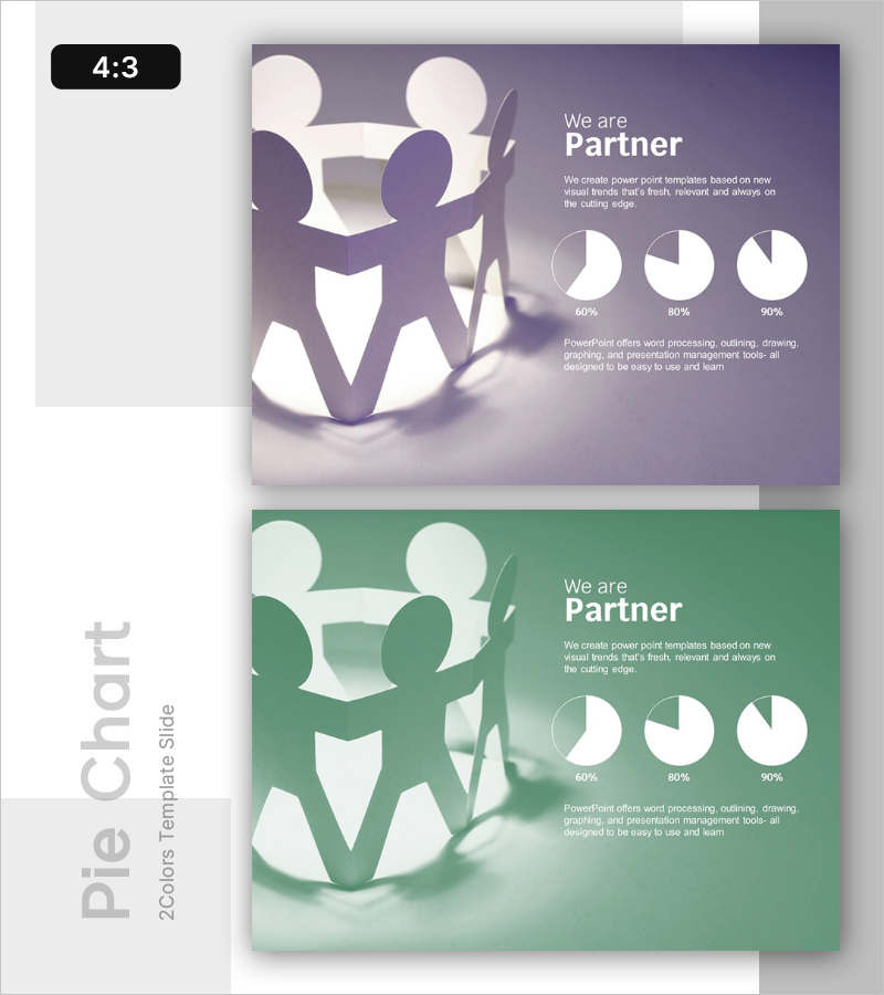
Partner Analysis Pie Chart – The Strength of Data Visualization
RL0100015_3
- Last Update 12/21/2025
- File Size 3.1MB
- # of Slides 2
- File Format PPTX
- Slide Ratio 4:3
- Color
Keywords
About the Product
This slide features a pie chart template for partner analysis. It clearly visualizes information such as 60%, 80%, and 90%, demonstrating the strength of data visualization. The harmonious color combination of purple and green provides stability to the presentation while effectively separating the title area and chart area for better readability. It can be used in various business contexts, including partner analysis, market share, and competitor analysis, emphasizing the importance of collaboration with the theme of 'Partner'. Text, numbers, and chart elements can be easily replaced, with an overall editing difficulty rated as 'easy', making it a practical template ready for immediate use.