Company Introduction
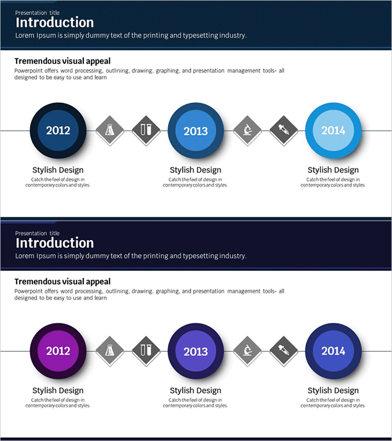
Scientific History Connection Diagram – Visualizing the Flow of Information
RJ0400019_4
- Last Update 12/21/2025
- File Size 0.4MB
- # of Slides 2
- File Format PPTX
- Slide Ratio 16:9
- Color
Keywords
About the Product
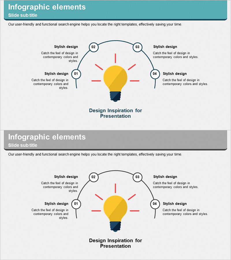
This slide is a divided diagram that visually displays the history of science. Each year is represented with circular icons, making it easy to follow the flow of information. Users can utilize this design to organize and present key milestones and developments chronologically. It is particularly useful for corporate presentations or sharing research findings. The color scheme emphasizes a professional look with blue and purple tones, enhancing viewer engagement. The editing difficulty is rated as 'easy', allowing for quick replacements of text and images for fast application.
Related Products
-
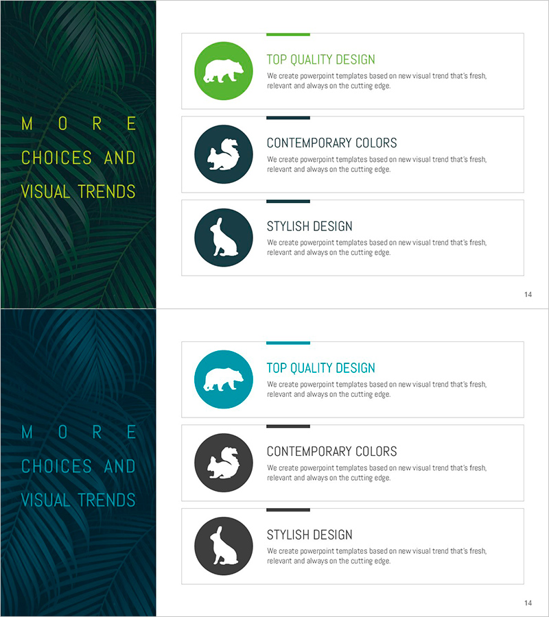
Animal Silhouettes and Features – Practical Slide with Characteristics and Design
#Product/Service #Diagram #Features
-
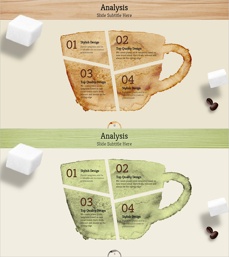
Coffee Marks and Analysis Diagrams
#Operation Plan #Diagram #Production and Technological Development Strategy
-
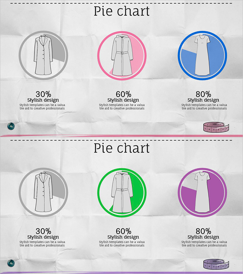
Pie Chart of Composition Ratio by Fashion Type – The Start of Data Visualization
#Company Introduction #Market and Competitor Analysis #Diagram
-
Breakthrough Idea Planning Diagram - Strategy for Business Success
#Product/Service #Business Promotion Strategy #Diagram
