Simple Company Overview Slide – Clean Design for Professionals
RJ0300023_34
- Last Update 04/24/2025
- File Size 0.3MB
- # of Slides 2
- File Format PPTX
- Slide Ratio 16:9
- Color
Keywords
About the Product
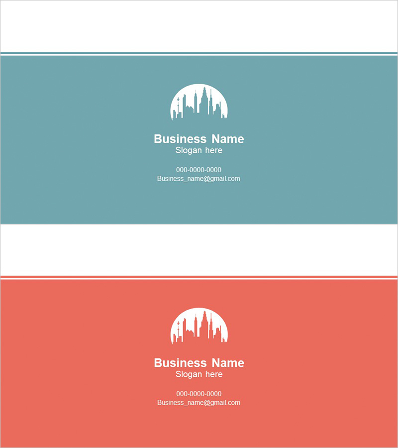
A professional company overview PowerPoint slide set that conveys corporate credibility and brand identity. Featuring a teal background with white typography and symbol icons, this 2-slide template provides dedicated spaces for company name, slogan, and contact information. The balanced layout between logo placement and text areas makes it ideal for corporate presentations, company profile decks, and investor pitches. Available in 16:9 widescreen PPTX format, fully editable across all PowerPoint versions with customizable colors, fonts, and layouts.
Usage Points
-
Main Usage
Presents essential company information—name, slogan, and contact details—to investors, partners, and clients with visual clarity and professional credibility. Establishes corporate identity at the beginning of company introductions, business plans, and investor relations materials.
-
How to Use
Use at the opening of company presentations to introduce organizational overview. Insert company logo in the designated space and replace placeholder text with actual company name, slogan, and contact information. Suitable for investor meetings, employee onboarding, partnership discussions, and corporate events.
-
Recommended For
Ideal for corporate executives, marketing teams, sales professionals, and investor relations specialists preparing company profiles, business proposals, pitch decks, and partnership presentations. Particularly effective for B2B contexts where credibility and professionalism are paramount.
-
Slide Structure
Two-slide layout with logo space at the top, company name and slogan text area in the center, and contact information section at the bottom. Teal background with white typography creates strong visual contrast for optimal readability, while symbol icons serve as visual focal points.
Related Products
-

Service Technical Characteristics and Overview – Innovative and Practical Design
#Company Introduction #Product/Service Introduction #Diagram
-

Application Overview and Intro Slide
#Slide Type #Company Introduction #Intro
-

Travel Business Company Overview Slide
#Company Introduction #Business Introduction #Company Overview
-

Presenting Company Overview with Business City Template
#Company Introduction #Business Introduction #Company Overview
