Presentation Template Visualizing Key Achievements with Doughnut Chart
RJ0200029_17
- Last Update 04/05/2025
- File Size 1MB
- # of Slides 2
- File Format PPTX
- Slide Ratio 16:9
- Color
Keywords
About the Product
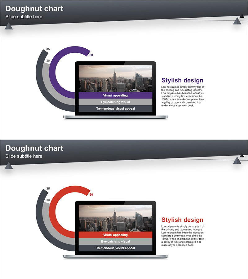
A two-slide PowerPoint presentation featuring doughnut charts for visualizing key performance metrics and business achievements. The layout combines a purple doughnut chart on the first slide and a red doughnut chart on the second, each with a central image insertion area and right-aligned text description space. Designed for company overview presentations, quarterly reports, and investor pitch decks. The 16:9 widescreen format allows full customization of chart values, labels, and text content. Ideal for presenting quantitative data, performance indicators, and comparative analysis in a visually engaging manner.
Usage Points
-
Main Usage
Visualize key performance indicators and business metrics using doughnut charts, with supporting imagery and descriptive text. The dual-color design enables side-by-side comparison of two different metrics or time periods, making it effective for data-driven decision-making presentations.
-
How to Use
Use in company overview presentations during the performance section, business reports for results analysis, or investor pitch decks for highlighting key metrics. Customize the chart values and labels with your actual data, insert relevant images or supporting graphics in the center area, and modify text descriptions to match your presentation narrative.
-
Recommended For
Executives, business managers, marketing teams, financial analysts, and investor relations professionals who need to communicate quantitative results persuasively. Particularly useful for quarterly earnings presentations, new business proposals, investor relations meetings, and performance reviews.
-
Slide Structure
Each slide features a header section with title and subtitle, a doughnut chart on the left with numerical labels, a central image insertion area, and a right-aligned text description box. Both slides share the same layout structure but use different chart colors (purple and red) to effectively compare multiple performance metrics.
Related Products
-

Patent-based Business Model - Emphasizing Corporate Achievements PowerPoint Template
#Company Introduction #Other #Awards and Certifications, and Patents
-

Chart Analysis of External Activities – Performance and Strategy
#Company Introduction #Business Strategy #Diagram
-

Awards and Certificates List Slide – Highlighting Achievements
#Company Introduction #Other #Awards and Certifications, and Patents
-

New Drug Development Patent Certificate – Company Profile and Awards
#Company Introduction #Other #Awards and Certifications, and Patents
