Visualizing Scientific Networks with a Diffusion Diagram
RB0800034_13
- Last Update 03/24/2025
- File Size 1.4MB
- # of Slides 2
- File Format PPTX
- Slide Ratio 4:3
- Color
Keywords
- #Content-Based Slides
- #Design-Based Slides
- #Business Introduction
- #Technical Approach
- #Diagram
- #Business Areas
- #Service Architecture Diagram
- #Spread
- #Centralized Diagram
- #4:3
- #radial diagram PowerPoint
- #diffusion diagram slide template
- #6-node network visualization
- #scientific presentation diagram
- #business strategy PowerPoint slide
About the Product
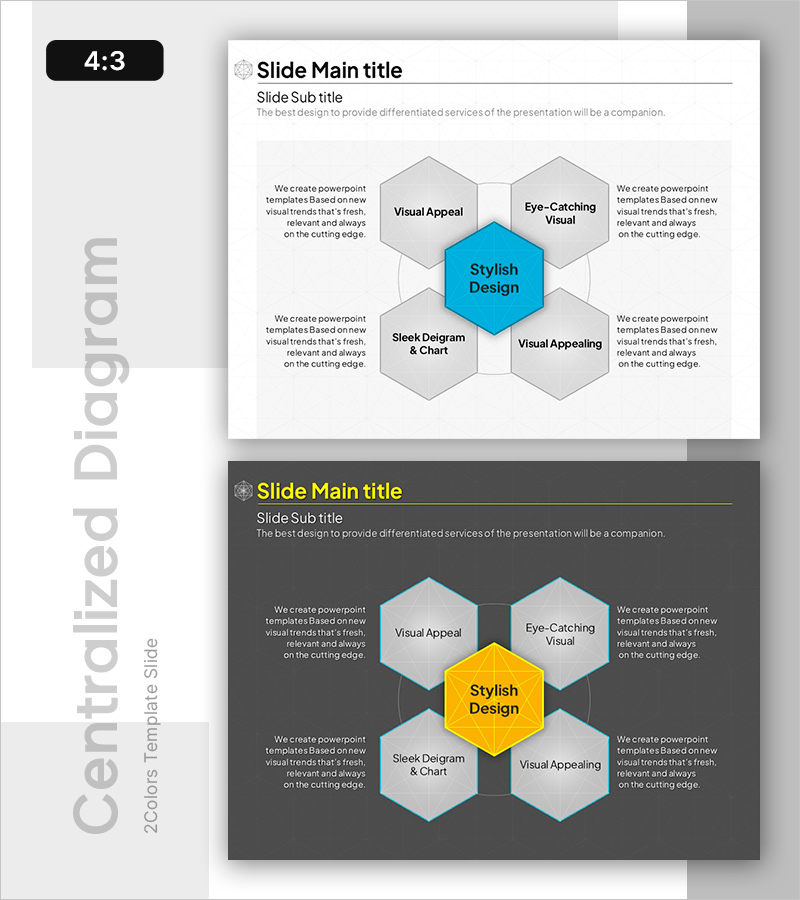
A radial diffusion diagram PowerPoint slide with a central concept expanding into six directional elements. This design places your core topic in the center hexagon and distributes six supporting elements around it, making it ideal for visualizing scientific networks, business strategies, organizational structures, and complex relationships. The blue central node contrasts with gray surrounding hexagons to clearly establish hierarchy, while each node provides flexible space for text and detailed descriptions. The 4:3 aspect ratio with 2 slides is ready for immediate use in presentations.
Usage Points
-
Main Usage
Visualizes information structures that radiate outward from a central concept or theme. Effectively communicates scientific research networks, multiple business strategy execution paths, organizational departmental roles, and complex relationship hierarchies in an intuitive visual format.
-
How to Use
Enter your core topic in the central blue hexagon and add supporting details in the six surrounding gray nodes. Utilize the text areas within each node for descriptions and modify colors as needed to adjust emphasis levels. Apply animations aligned with your presentation flow for enhanced impact.
-
Recommended For
Scientific and technical research presentations, business strategy development and execution planning, organizational structure and role distribution, multi-channel marketing campaign strategies, educational seminars, and training materials.
-
Slide Structure
2-slide set. First slide features a light background with blue central node and six gray surrounding hexagons in radial diffusion pattern. Second slide provides a color variation with dark background, yellow central node, and light gray surrounding nodes for visual flexibility.
Related Products
-

Configuration Diffusion Diagram – Business Area and Technology Sector
#Business Introduction #Technical Approach #Diagram
-

Core Service Structure Diagram – Exploring Business Areas
#Business Introduction #Technical Approach #Diagram
-

Healthcare System Architecture Diagram – Business Scope and Service Composition
#Business Introduction #Technical Approach #Diagram
-

Service Structure Expansion Diagram – Efficient Business Introduction
#Business Introduction #Technical Approach #Diagram
