Effective Information Delivery Through Data Visualization
RB0800013_6
- Last Update 03/20/2025
- File Size 7.6MB
- # of Slides 2
- File Format PPTX
- Slide Ratio 4:3
Keywords
About the Product
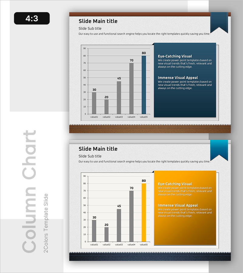
A PowerPoint slide template featuring a five-item column chart with numerical data visualization. The left side displays a gray-toned bar chart (values: 30, 20, 45, 70, 80), while the right side includes a dark blue text box for key messaging. This 4:3 ratio, 2-slide set is ready for immediate use in presentations, business analysis, market reports, and financial summaries. The data-driven layout supports decision-making in financial reporting, marketing analysis, and business performance presentations.
Usage Points
-
Main Usage
Visualizes five data points using a column chart to enable clear comparative analysis. The right-side text box accommodates key insights, allowing simultaneous data interpretation and message delivery in a single slide.
-
How to Use
Apply to financial reports for revenue, cost, and profit trend comparisons; marketing analysis for channel or product performance metrics; business updates for quarterly or regional performance tracking. Edit chart values and text content to match your presentation context for immediate deployment.
-
Recommended For
Finance teams presenting income statements and budget analysis; marketing teams showcasing market conditions and competitive benchmarking; executive reports on business performance and KPI trends; consulting proposals requiring data-backed insights.
-
Slide Structure
Two-section layout: left side features a column chart area (5 data points, 0–90 scale) with 5 editable value fields; right side contains a dark blue text box with 2 text input sections ('Eye-Catching Visual' and 'Immense Visual Appeal'). Total of 7 editable content areas.
Related Products
-

Company Capabilities PowerPoint Slide – 3-Circle Icon Layout
#Company Introduction #Product/Service Introduction #Business Vision and Strategy
-

Customer Reviews PowerPoint Slide – Photo Grid Speech Bubble
#Customer Success Stories #Text Box #Customer Testimonials and Feedback
-

Plogging Route Presentation Slide – 9-Point S-Curve Timeline
#Company Introduction #Business Strategy #Corporate Social Responsibility
-

Contact Closing PowerPoint Slide – Interior Dark Two-Column
#Company Introduction #Contact Information
