Progressive Graph Slide for Effective Data Presentation – Eye-Catching Visual Impact
RB0800004_14
- Last Update 03/17/2025
- File Size 3MB
- # of Slides 2
- File Format PPTX
- Slide Ratio 4:3
Keywords
About the Product
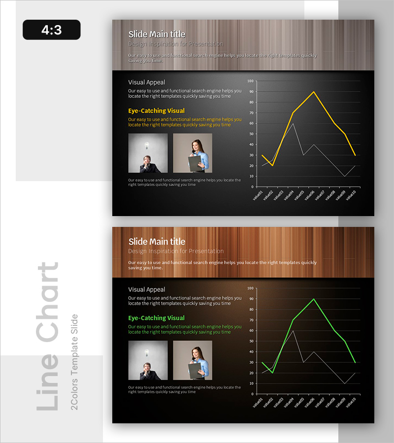
A data visualization PowerPoint slide designed to present changing trends and comparative metrics over time. The slide features a wood-tone header section at the top with a black chart area below, using a gold accent line and gray comparison line to distinguish two data series clearly. The left side includes descriptive text blocks about visual appeal and eye-catching design elements, accompanied by two professional images. The right side displays a line chart showing monthly progression with dual-line comparison. This 2-slide set is ready for immediate use in presentations, reports, and business decks. The PPTX format allows easy customization of data, text, and visual elements.
Usage Points
-
Main Usage
Effectively visualize monthly, quarterly, or annual data trends to support data-driven decision-making. The dual-line chart format is ideal for comparing two metrics, making it perfect for performance analysis, market trend reporting, revenue tracking, and competitive benchmarking.
-
How to Use
Integrate this slide into business reports, marketing analysis presentations, and financial briefing materials. Replace the sample data in the chart with your actual figures, customize the text descriptions on the left, and insert your own images to create a professional data presentation ready for stakeholder meetings.
-
Recommended For
Finance teams, marketing analysts, business intelligence professionals, report writers, and executives preparing quarterly or annual performance presentations. Ideal for investor presentations, board meetings, management briefings, and any presentation requiring quantitative evidence and trend analysis.
-
Slide Structure
Wood-tone header section with title and subtitle fields; left side contains two text blocks (visual appeal and eye-catching elements descriptions) plus two image placeholders; right side features a dual-line chart (gold and gray series) with monthly X-axis and 0-100 Y-axis scale. Two-slide format enables flexible data comparison and multi-period analysis.
Related Products
-

Market Demand Analysis PowerPoint Slide – Donut Chart Layout
#Market and Competitor Analysis #Graph #Customer Analysis
-

Project Overview PowerPoint Slide – 4-Spec Dark Real Estate
#Product/Service Introduction #Business Strategy #Diagram
-

Plogging Route Presentation Slide – 9-Point S-Curve Timeline
#Company Introduction #Business Strategy #Corporate Social Responsibility
-

Business Outcome PowerPoint Slide – 3-Circle Solution Hub
#Company Introduction #Business Strategy #Diagram
