Glassmorphism Template Contents – Clear and Stylish Design
RM0800008_2
- Last Update 02/28/2025
- File Size 0.2MB
- # of Slides 2
- File Format PPTX
- Slide Ratio 16:9
- Color
Keywords
About the Product
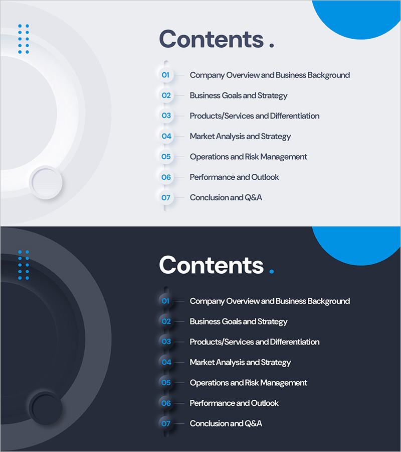
A professional contents slide for PowerPoint presentations that clearly outlines your presentation structure. This slide deck features glassmorphism design with semi-transparent elements and blue accent colors for a contemporary look. Two versions are included—light tone with a soft gray background and dark tone with a deep navy background—allowing you to match your presentation theme. The layout displays 7 sections with numbered items and clear titles in a simple, highly readable text format. Perfect for business presentations including company profiles, business plans, proposals, and investment pitches. Provided in 16:9 widescreen PPTX format for seamless integration.
Usage Points
-
Main Usage
Introduce your presentation structure to the audience and establish a clear flow for your talk. The glassmorphism design with semi-transparent elements and blue highlights creates a modern, trustworthy first impression.
-
How to Use
Select either the light or dark version from the 2-slide deck and place it at the beginning of your presentation. Edit the 7 section titles to match your content, and reference this slide when transitioning between sections to maintain audience engagement.
-
Recommended For
Ideal for business presentations with 7 or more sections, including company overviews, business plans, proposals, investment pitches, marketing strategies, product introductions, and training seminars. Particularly effective for technology, finance, and consulting industries where credibility is essential.
-
Slide Structure
Each slide features a 'Contents' title at the top, glassmorphism decorative shapes on the left, and 7 centered items (numbered 01–07 with section names) in a clean text layout. The light version uses dark text on a bright background; the dark version uses white text on a deep background for optimal contrast and readability.
Related Products
-

Diagonal Theme IR Template Contents – Company Introduction and Strategy
#Slide Type #Table of Contents
-

Hexagon 3D Company Profile Template Contents - Visually Appealing Structure
#Slide Type #Table of Contents
-

Table of Contents Slide – Rounded Edge Business PowerPoint
#Slide Type #Table of Contents
-

Photography Proposal Template Contents – Professionalism and Creativity
#Slide Type #Table of Contents
