Hospital Company Profile Slide – Contact Information
RM0300017_23
- Last Update 02/11/2025
- File Size 0.8MB
- # of Slides 2
- File Format PPTX
- Slide Ratio 16:9
- Color
Keywords
About the Product
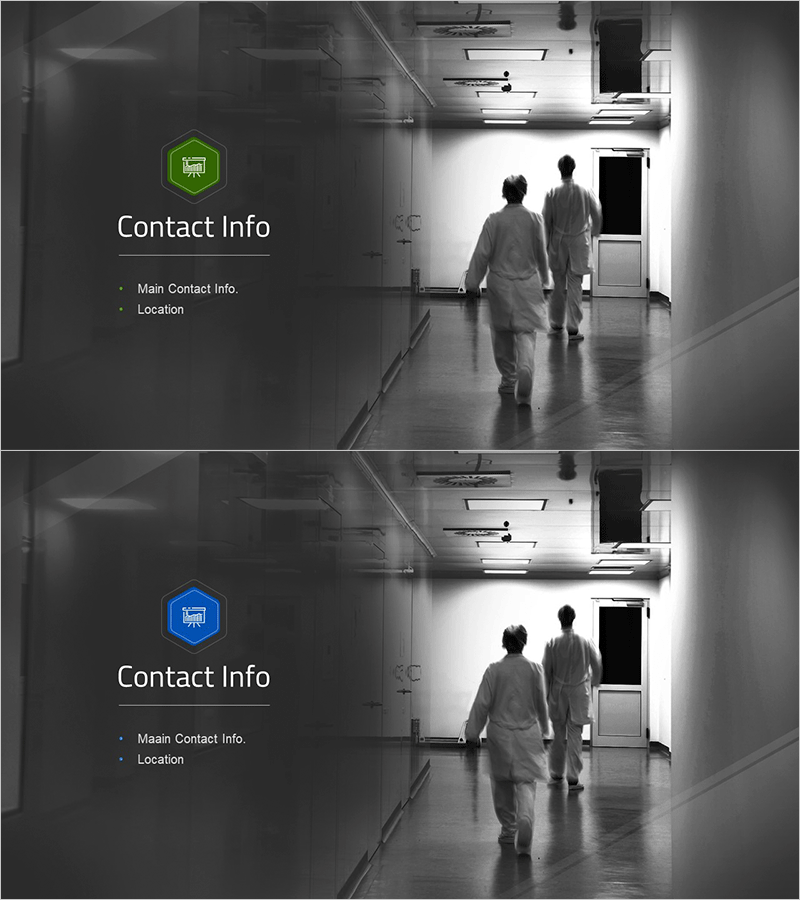
A professional contact information PowerPoint slide designed for hospital and healthcare facility company profile presentations. The left side features two color-coded icon badges (green and blue) with two text input areas for main contact details and location information, while the right side displays a hospital corridor and medical staff background image to convey trust and professionalism. This 2-slide 16:9 PPTX template is ready for immediate editing, with customizable icon colors to match your hospital brand identity. Perfect as the closing slide in company introductions to clearly communicate contact details to clients, partners, and investors.
Usage Points
-
Main Usage
Serves as the final slide in company introductions, proposals, and investor presentations to clearly present contact information and location details to clients, partners, and stakeholders. Reinforces hospital credibility and accessibility.
-
How to Use
Enter main contact details (phone, email, contact person) and location information (address, map, directions) in the two left-side text input areas. Customize icon colors to match your hospital brand, and replace the right-side background image with your facility or medical staff photos to align with your presentation context.
-
Recommended For
Ideal for hospitals, medical centers, clinics, pharmacies, and medical device companies presenting company profiles, partnership proposals, investor pitches, and patient/client briefing materials. Suitable for medical staff, administrators, and marketing teams.
-
Slide Structure
2-slide layout: left section with 2 color-coded icon badges and 2 text input areas; right section with background image. Icons use color differentiation (green and blue) to establish information hierarchy, while text follows bullet-point format for optimal readability.
Related Products
-

Blossom Cosmetics Template Section Cover – Luxury Embedded in Nature
#Slide Type #Section Cover
-

Wedding Preparation Presentation Template Chapter 02
#Slide Type #Section Cover
-

Smart Healthcare Template Section Slide 02 - Innovative Design for Section Cover
#Slide Type #Section Cover
-

Astronomy Observation Template Section Slide – A New Way to Explore the Universe
#Slide Type #Section Cover
