Graph of Volunteer Participation by Region
RL0100069_4
- Last Update 01/22/2025
- File Size 1.4MB
- # of Slides 2
- File Format PPTX
- Slide Ratio 4:3
- Color
Keywords
About the Product
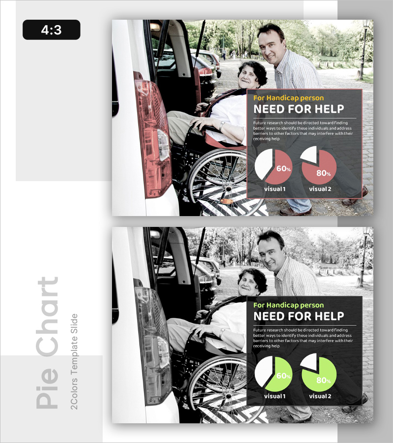
A PowerPoint slide designed for social welfare policy presentations, community development projects, and disability support program planning. The layout combines a real-world photograph on the left with data visualization on the right, merging qualitative context and quantitative evidence. The dark gray background with coral-pink accent colors draws attention to key metrics, while two pie charts enable clear comparative analysis. This 4:3 aspect ratio, 2-slide set provides flexible integration into presentation flows for government agencies, nonprofits, and social service organizations.
Usage Points
-
Main Usage
Present disability support needs assessment using data-driven evidence in social welfare policy briefings, community development planning, and service allocation discussions. The combination of real-world imagery and quantitative charts strengthens decision-making credibility and stakeholder buy-in.
-
How to Use
Place this slide in the situation analysis or background section of your presentation, before policy recommendations. Replace the left-side photograph with your organization's actual field images and update the pie chart percentages with your own data to create a customized, evidence-based presentation.
-
Recommended For
Social welfare administrators, community development planners, disability policy makers, nonprofit and NGO leaders, and government agency report writers. Ideal for budget hearings, policy briefings, fundraising presentations, and stakeholder engagement meetings.
-
Slide Structure
Two-slide set with a split-panel design: left side accommodates image insertion (photograph or illustration), right side contains title text (1 line), descriptive paragraph, and two pie charts. Optimized for 4:3 aspect ratio with three text input fields and two chart areas for data customization.


