Airline Utilization Rate Analysis Graph – Visualization Reflecting Market Insights
RL0100064_4
- Last Update 01/22/2025
- File Size 1.7MB
- # of Slides 2
- File Format PPTX
- Slide Ratio 4:3
- Color
Keywords
About the Product
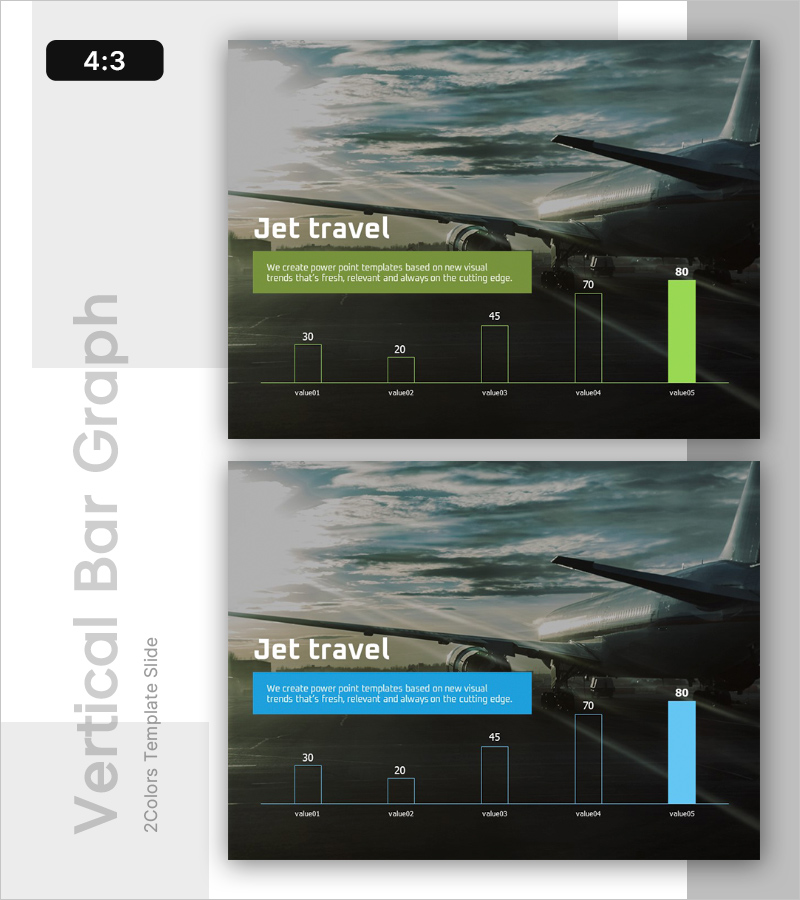
A PowerPoint slide that compares airline utilization rates across five data points using both vertical and horizontal bar charts. This dual-representation approach allows audiences to interpret the same dataset from multiple perspectives. The design features a dark background with lime green accent bars, reflecting current data visualization trends. A semi-transparent text overlay integrates the title and description seamlessly with the background imagery. Ideal for aviation industry presentations, travel market analysis, and competitive benchmarking reports.
Usage Points
-
Main Usage
Supports data-driven decision-making in aviation market analysis, travel agency performance comparison, and airline competitive positioning. The dual bar chart format enables simultaneous comparison of five metrics and trend identification, enhancing audience comprehension and engagement.
-
How to Use
Insert actual airline utilization rate figures directly into the slide for immediate deployment. Update the title with your analysis topic, add key insights to the text box, and modify bar chart values to match your dataset. Suitable for investor presentations, executive briefings, and marketing strategy meetings.
-
Recommended For
Marketing teams at airlines and travel agencies, market research analysts, management consultants, investment analysts, and industry report writers. Particularly effective for B2B presentations and financial reports where quantitative data emphasis is critical.
-
Slide Structure
Title area (Jet travel text), one descriptive text box, vertical bar chart with five values (value01–value05: 30, 20, 45, 70, 80), horizontal bar chart displaying the same five metrics. Two-slide 4:3 format compatible with standard projector environments.
Related Products
-

Vibrant Intro Slide for Generation Z
#Emotional Messages
-

Presentation Slide for Valuable Consumer Goods Introduction and Diagram
#Emotional Messages
-

Come up with an Innovative Idea – Bar Graph for Market Analysis
#Emotional Messages
-

Introduction to Social Networks – Presentation with Modern Flair
#Emotional Messages
