Efficient Time Management Analysis Graph
RL0100053_3
- Last Update 01/21/2025
- File Size 1.9MB
- # of Slides 2
- File Format PPTX
- Slide Ratio 4:3
- Color
Keywords
About the Product
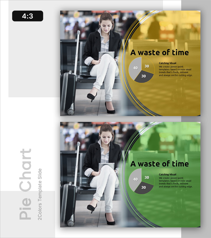
A PowerPoint slide optimized for vision and future strategy presentations, featuring time management analysis with two color versions: yellow and green backgrounds. The slide layout divides the space into a left image area showcasing real business scenarios and a right information section with title, descriptive text, and a pie chart displaying 40·30·30 time allocation ratios. Provided in 4:3 aspect ratio PPTX format, this slide integrates seamlessly into existing presentations and effectively communicates organizational time efficiency, resource allocation, and priority management through visual representation.
Usage Points
-
Main Usage
Visualizes organizational time resource allocation, priority management, and efficiency improvement strategies through a pie chart, enabling clear communication with executives and team members. Used in vision and future strategy sections to explain time investment plans and phased schedule distribution.
-
How to Use
Enter your organization's time management objectives and current status in the title and description text areas on the right side of the slide. Replace the pie chart values (40·30·30) with actual data. Select either the yellow or green background version that aligns with your corporate brand and presentation tone.
-
Recommended For
Ideal for executives, strategy teams, HR professionals, and project managers presenting time resource allocation, work priorities, and efficiency improvement initiatives. Suitable for business plans, management reports, strategic presentations, and organizational improvement proposals.
-
Slide Structure
Two-slide composition with each slide divided into a left image area (representing business scenarios) and a right information section (title, description, and pie chart). The pie chart contains three segments illustrating time allocation ratios, with three text input areas: title, description, and legend.
Related Products
-

Radical Social Advancement – Innovation through Visual Appeal
#Emotional Messages
-

Future-oriented Template Cover – Bright Vision Ahead
#Emotional Messages
-

Opportunities for Advancement in Life – Vision and Strategy for Success
#Emotional Messages
-

Potential Template Cover – A Professional and Emotional Start
#Emotional Messages
