Graph Comparing Happiness Index by Country – Market Research Slide
RL0100050_4
- Last Update 11/21/2024
- File Size 5MB
- # of Slides 2
- File Format PPTX
- Slide Ratio 4:3
- Color
Keywords
About the Product
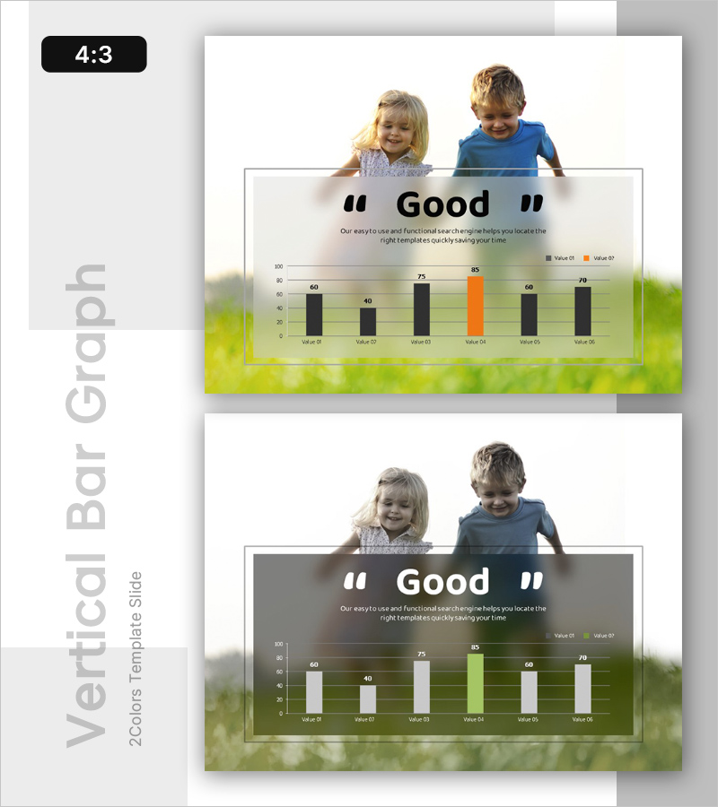
A PowerPoint slide that visually compares happiness index levels across countries using a vertical bar chart. The chart features black and orange bars representing two data series across six categories, displayed on a semi-transparent white overlay against a green natural background. The layout includes dedicated areas for title and descriptive text, ensuring clear readability and professional presentation. This slide is ready to use in market research reports, statistical analysis presentations, and comparative studies.
Usage Points
-
Main Usage
Quantitatively compare happiness index levels across nations and visualize market research findings. The dual-color bar format enables side-by-side comparison of two data values for each category.
-
How to Use
Insert this slide into market analysis reports, statistical presentations, or comparative research documents. Edit the chart values and legend with your own data for immediate use in professional presentations.
-
Recommended For
Marketing professionals, research analysts, statisticians, academic presenters, consultants, and data-driven decision makers who need to communicate comparative metrics effectively.
-
Slide Structure
Organized into three sections: title area (top), descriptive text field (upper-middle), and vertical bar chart (lower section). The chart displays six categories with two comparable data values each, creating a dual-series comparison layout.


