Analysis of Agricultural Territory Size by Region in the United States – Productivity and Strategy
RJ0600073_9
- Last Update 07/09/2025
- File Size 3.8MB
- # of Slides 2
- File Format PPTX
- Slide Ratio 16:9
- Color
Keywords
- #Content-Based Slides
- #Design-Based Slides
- #Market and Competitor Analysis
- #Marketing Plan and Strategy
- #Other
- #Target Market
- #Target Market Strategy
- #Map
- #16:9
- #map infographic PowerPoint
- #US regional analysis slide
- #geographic data visualization presentation
- #regional comparison map slide
- #market analysis map template
About the Product
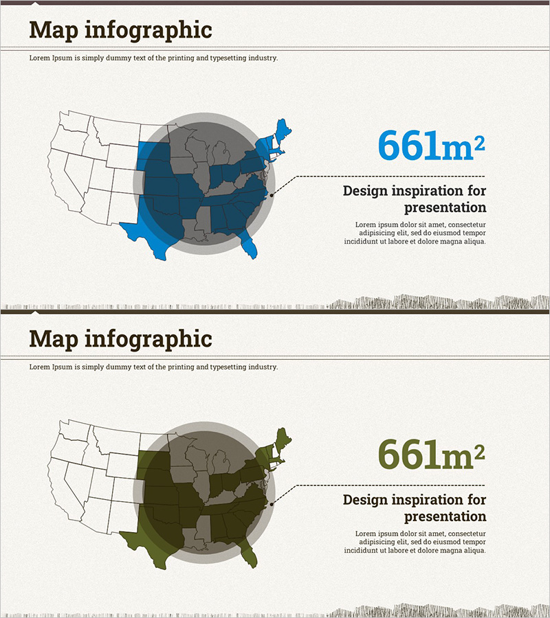
A PowerPoint slide featuring a US regional map infographic designed for data visualization and geographic analysis. Two color versions (blue and olive) are included, each displaying a US map with region-specific highlighting and numerical data (661m²) positioned alongside descriptive text. The layout clearly separates data visualization from explanatory content, making it ideal for market analysis, territory size comparison, and regional strategy presentations. Provided in 16:9 widescreen format with 2 slides, allowing you to select colors that match your presentation flow and branding.
Usage Points
-
Main Usage
Visualizes regional data comparison and market analysis using map-based infographics. Effectively presents quantitative data by region—such as territory size, productivity, and market share—to support decision-making with clear geographic context.
-
How to Use
Highlight the relevant regions on the US map using color, then enter your numerical data and explanatory text in the right-side text area. Choose between the two color versions based on your presentation theme and existing template palette.
-
Recommended For
Ideal for market analysis, regional strategy development, and territory comparison presentations. Particularly valuable in agriculture, real estate, distribution, and marketing sectors when explaining region-level data. Builds credibility in investor and partner presentations.
-
Slide Structure
Each slide features a US map on the left (with highlighted regions in color and background regions in gray), paired with numerical data (e.g., 661m²) and descriptive text on the right. Both slides share identical layout with only color variations, enabling comparative analysis or temporal progression visualization.
Related Products
-

Map of Major Target Areas in the United States – Market Analysis and Marketing Strategy
#Market and Competitor Analysis #Marketing Plan and Strategy #Other
-

Asia-Focused Market Penetration Status - Data-Driven Market Analysis
#Market and Competitor Analysis #Marketing Plan and Strategy #Graph
-

Current Status of Fountain Pen Business by Country – Infographic Template for Market Analysis
#Market and Competitor Analysis #Marketing Plan and Strategy #Other
-

Worldwide Marketing Strategy Visualized on Map
#Market and Competitor Analysis #Marketing Plan and Strategy #Other
