Color Cosmetics Template Cover – Style and Glamour
RJ0600010
- Last Update 06/23/2025
- File Size 2.1MB
- # of Slides 2
- File Format PPTX
- Slide Ratio 16:9
- Color
Keywords
About the Product
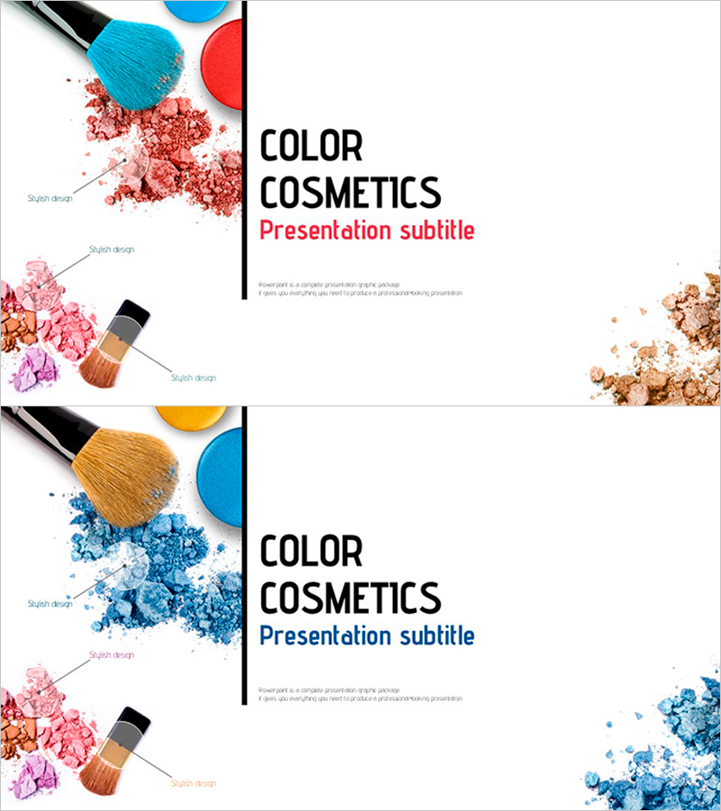
A professional cover slide set featuring two color variations for cosmetics brand presentations. The design combines product imagery and powder texture elements on the left side with a clean text layout on the right, creating visual impact while maintaining readability. Each slide includes dedicated areas for title, subtitle, and descriptive text, allowing seamless customization for beauty product launches and marketing presentations. Available in 16:9 widescreen PPTX format with fully editable elements, ready for immediate use in cosmetics, beauty, and skincare brand presentations.
Usage Points
-
Main Usage
Establish a strong first impression for cosmetics and beauty brand presentations with this dual-color cover slide set. The design effectively communicates brand identity and product premium positioning through harmonized product imagery and powder texture elements, ideal for product launches, brand introductions, and marketing presentations.
-
How to Use
Select the color version that matches your brand identity—pink or blue. Replace the placeholder text with your company name, product name, and presentation title. Customize the product image area with your own cosmetics photography while maintaining the powder texture background to reinforce product category and visual consistency.
-
Recommended For
Perfect for cosmetics companies' marketing teams, product managers, and sales professionals presenting new product lines. Beauty influencers, beauty editors, skincare retailers, and cosmetics distributors can use this template for product showcases, customer presentations, and promotional materials.
-
Slide Structure
Two-slide layout with consistent 2-column design: left side features product imagery and powder texture elements, right side contains title (bold black uppercase), subtitle (color-coded in pink or blue), and descriptive text (gray lowercase). This hierarchy ensures clear information flow while maintaining visual balance.


